A click event is an event listener that listens for a user's click (or a tap if on a touchscreen device), and then some custom JavaScript can be run once triggered. JavaScript and HTML allow us to put click events on any HTML element, but just because we can doesn't mean we should.
Why is putting a click event on a div a bad idea?
There are countless articles on the web advising not to put click events on <div> HTML elements, but that's not the focus of this article, this article is quite the opposite so here is a TL;DR of why you should not put click events on <div> HTML elements.
A <div> HTML element, with no role attribute, is semantic-less: i.e. it has no semantic value at all, it solely exists for layout and styling purposes. This means, screenreaders or tabbing on a keyboard for example, will completely skip all semantic-less elements. A <span> is also a semantic-less HTML element. If these elements are being skipped, users who rely on screenreaders or keyboards are going to have a difficult time interacting with your element (hint: they won't be able to at all).
You could put tabindex="0" on the semantic-less element, meaning keyboards can now focus the element, but you lose so much other semantic value by not using the correct HTML in the first place: <button onclick="">...</button> (recommended) or <div role="button" onclick="">...</div>.
You can, by all means, put a click event on any element, you just need to ensure you're using the click event correctly and wisely.
When is it okay to put a click event on a div?
Now that we know it is taboo to put click events on semantic-less elements, let's explore a scenario where it would be considered perfectly fine to put a click event on a semantic-less element.
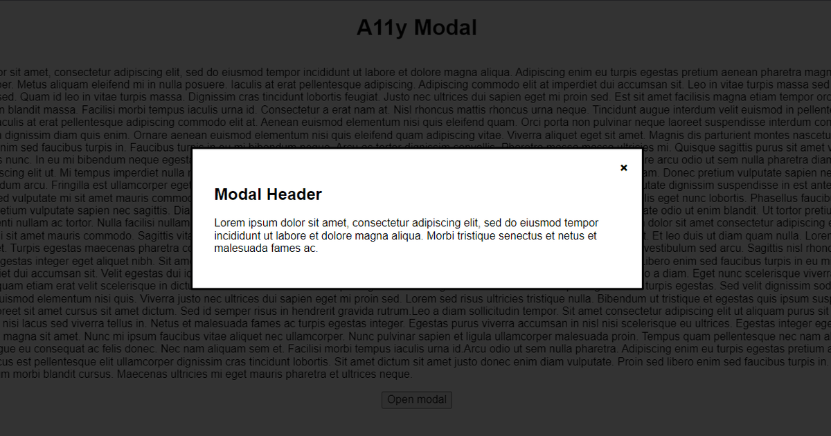
Behold... The Mighty Modal!
See the Pen A11y modal by @jackdomleo7 on CodePen
A modal is a fancy name for a pop-up window. When we consider a modal, as users, we typically assume there are 3 methods to close the modal:
Clicking the cross in the top corner
Clicking the greyed-out area behind the modal
Pressing the
Esckey on the keyboard
There may also be a "Cancel", "Close" or similar call-to-action button on the modal. In this case, we can ignore the Esc key method, since this is not related to clicking.
So, the 2 ways a user can close a modal by clicking is by clicking the cross, and by clicking the greyed-out area. The cross should obviously be a <button>X</button> since it is a user action. But what about the greyed-out area, should this be a button element too?
It could be a button element, but it would make the code look ugly and it isn't really necessary in this case. For this modal to be considered accessible, it needs at least 1 way for each type of user to close the modal. We have a semantic button element for the cross that a user can click or tab to, and we have the Esc key handler for keyboard users. This should cover the majority of users if not all.
Clicking the greyed-out area is a nice-to-have minor UX (user experience) improvement. A user who relies on semantic elements so that they can be identified by screenreaders and keyboards is not going to expect that they can interact with the greyed-out area, it might actually confuse them more if they see a huge focus ring around the entire greyed-out section, causing poorer UX for these users since they may not associate it with closing the modal.
In this case, we can add a nice simple <div onclick=""></div> for the greyed-out area and not have to worry about harming accessibility. Simple.


